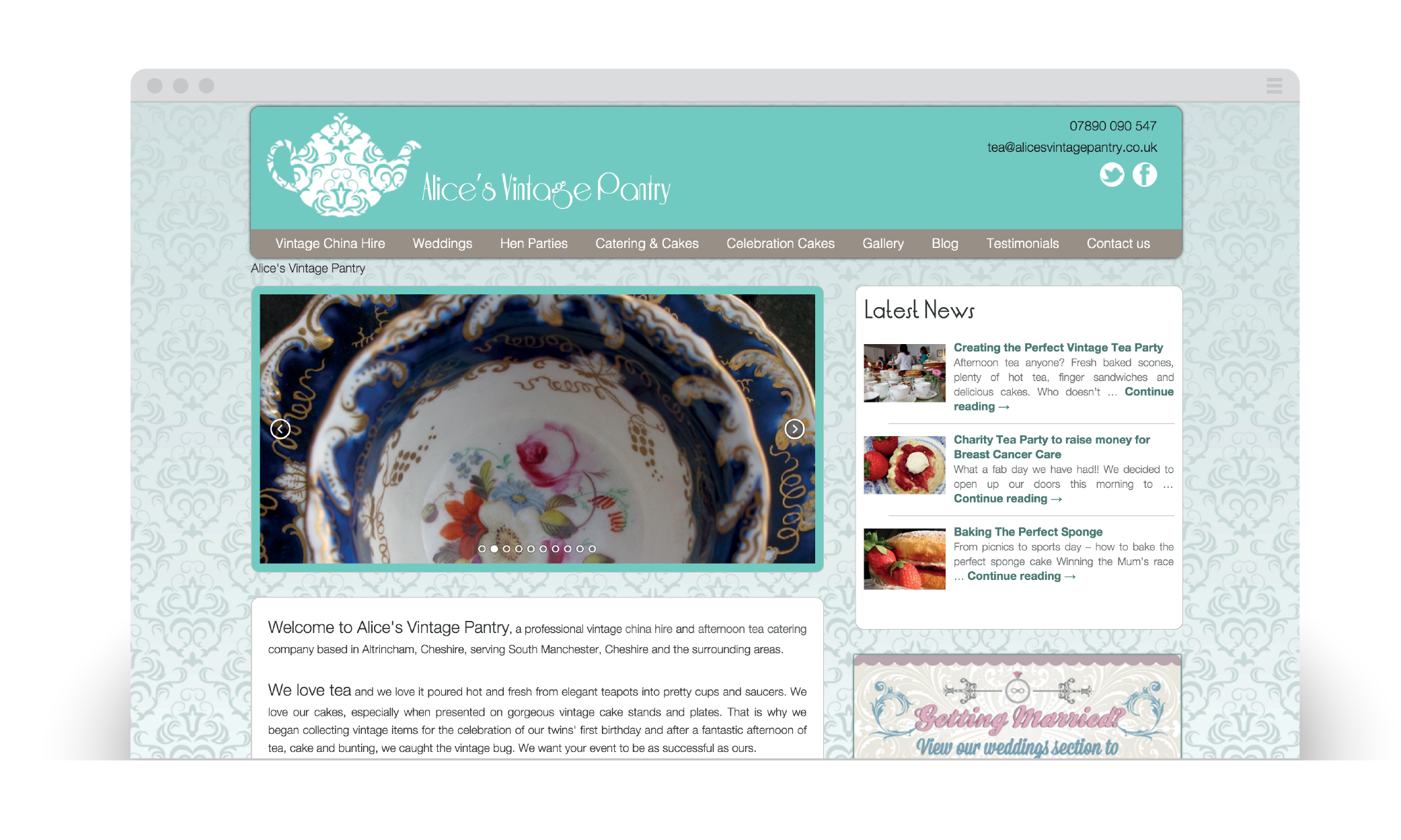
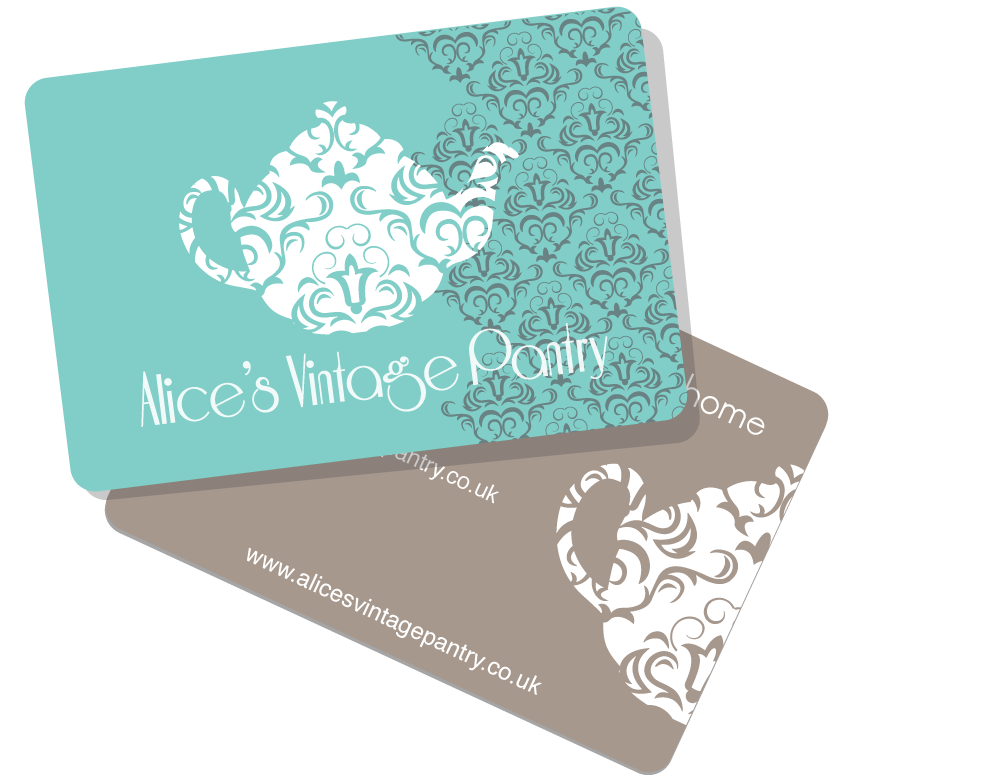
Alice's Vintage Pantry


Alice was starting her new business as a vintage crockery hire and catering service for special occasions. After explaining her business and brand I designed a number of logos for the company and we refined the look and tone to reflect the brand values. The teapot is a signature shape symbolising the key aspect of what Alice provides and the vintage element of the service.
I incorporated a symmetrical swirl pattern based on Victorian wallpaper I found. This projects the service provided by the company, not just the crockery, but the sense of the era, the emotion and ideals that come with it, the appreciation for home-made, intriquacy and quaintness. The logo should define the brand without words and Alice feels I achieved this.
The second major element for Alice was the website. This not only provides information on the services and cost, but also provides an outlet for Alice to speak to her customers through a blog. I utlised key vintage colours, the pattern in the logo and clean design to create a site that evokes vintage but holds up to modern standards.
To promote the crockery and catering, there are images on every page to show off the design and finish, to allow visitors to place these images within their special occasion.
Medical Collation & Chronology Limited


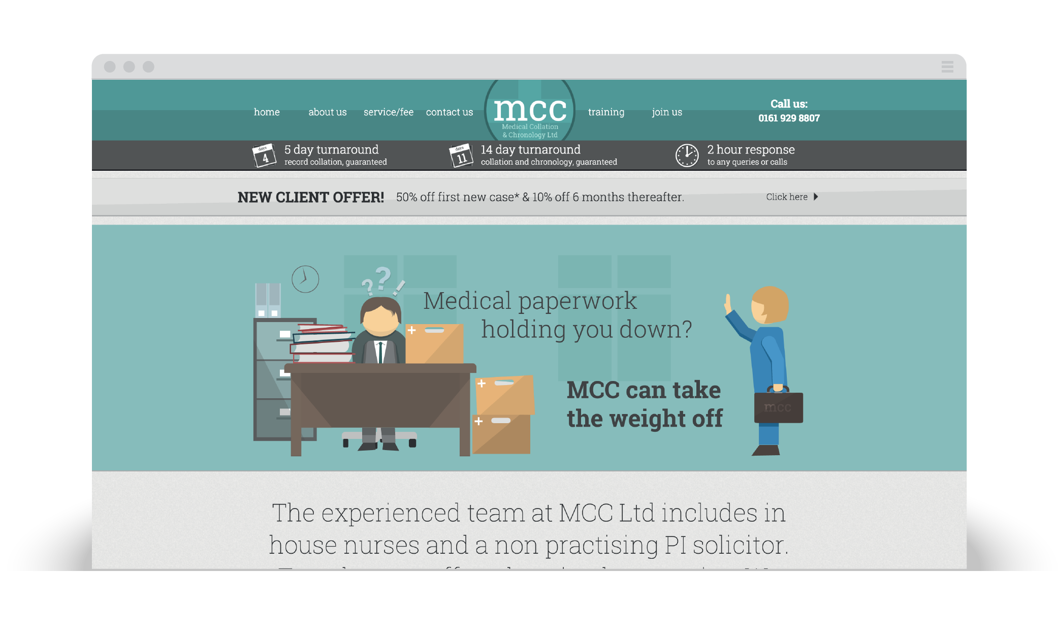
The brief for MCC Limited was to create a corporate website for a company offering services in collating and chronologically ordering medical records. As the project progressed and I became more wrapped up in the client's requirements, I was able to design and offer much more then the website.
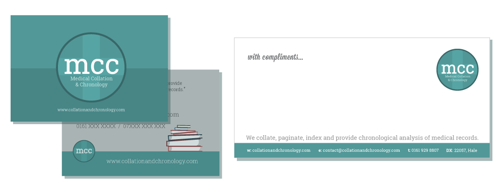
I designed the branding identity including logo and illustrations for the entire site. I created business cards, compliment slips, headed paper and other marketing materials.
The website itself is made up of 11 individually designed pages and is fully responsive down to mobile. It is specifically designed to reflect MCC's brand and caters to their target audience. There is a precise and clean design to the structure, with enough fluidity to the layout to allow content to be added, amended and removed as the site grows and matures.
I came up with a unique piece of marketing material for MCC Limited in the form of a jigsaw. The idea behind this concept is a playful take on the issue that solicitors face when receiving multiple complex medical records. To make sense of these records and order them into a coherent story is like piecing together a jigsaw puzzle.
I therefore designed and produced a 15 piece jigsaw puzzle that would be sent to clients. When the jigsaw is made, the message reads "We put the pieces together for you", with MCC's contact details present.
Dear Steven,
I thought it appropriate to inform you how impressed we are with the service you delivered.
I was given your details via a friend and I am so glad that I asked for recommendations for the build of a website which led me to you.
Being completely ignorant to all the requirements and details needed you gave a step by step guide with clear direction. You suggested alternatives that have made a significant difference to the look of our site from the visualisation we initially had and our site has gone beyond all expectations. Your creative skill gave us a unique look within our industry and allowed us to be different whilst still maintaining a corporate look.
I can honestly say that I have never worked with someone who has been so consistent and punctual to any changes, queries or advice we required ... a true professional. You worked relentlessly to meet our deadline for the site launch and you also initiated the branding of our company something which we are very proud of.
You have amazing ideas that have supported us in trying to capture the attention of the profession we want to service. I have had experience with a previous employer of a larger organisation building their website and I can honestly say working with you was a dream in comparison to what my former employer went through! You really do care about the design and quality of work. I would have no hesitation in recommending you to anyone and I truly cannot sing your praises enough!
Thank you Steven.


Hale Cycleworks
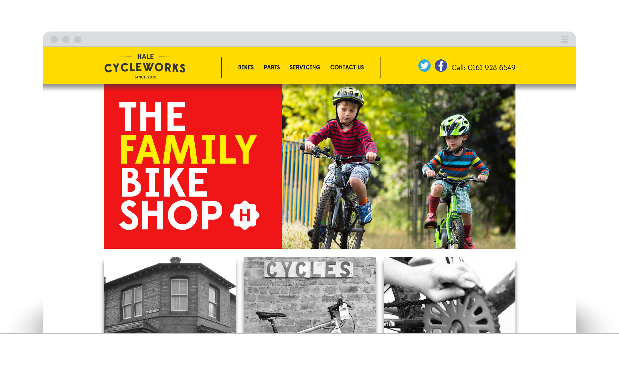
Hale Cycleworks is a bicycle company in Hale, with a physical retail shop. For this brief, I developed the logo that will be used on the site and in the store for signage, window decals, bicycle stickers etc.
I have also designed and developed the website, including a visual language of icons symbolise particular aspects of the services the store offers. The website has a clean spacious design, allowing for the bicycle and store photographs to be centre-stage on the pages of the website.
Lucy & Luc
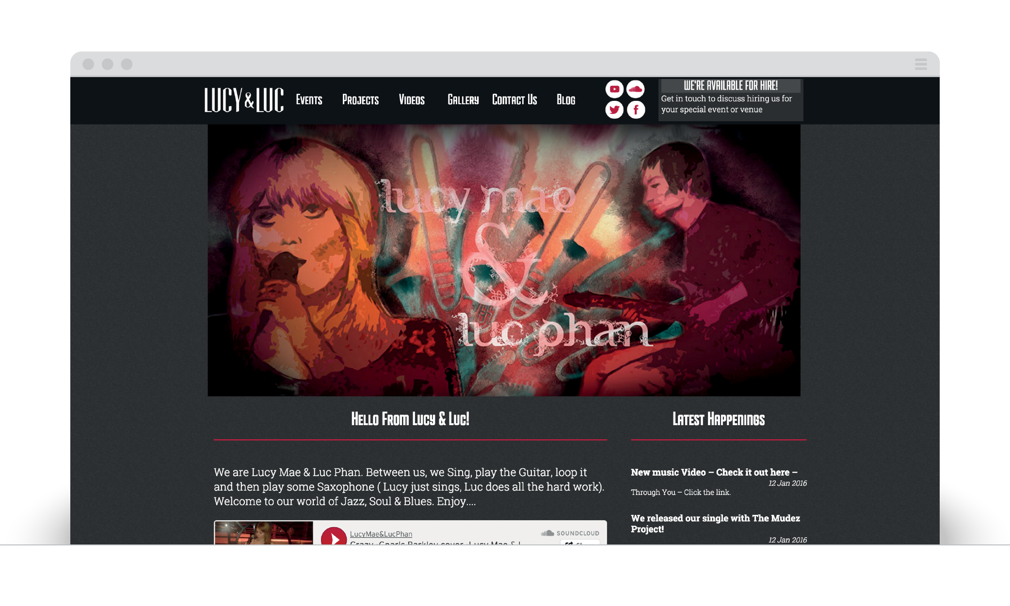
Lucy & Luc are a jazz duo who perform in bars, clubs and functions, in addtion to recording their own music and having a number of musical projects on the go. They wanted a website that they could update their community of followers and fans on events, performances, project updates etc, as well as providing areas to listen to and watch their recorded performances.
The logo created for Lucy & Luc uses a modified typeface to give the duo a strong visual identity that can be used on flyers and promotional material. I chose a typography logo as it holds more versatility then a visual logo, especially as third parties will be using the logo in their works. I wanted to ensure that clarity at any size and instant communication of who is performing is key.
The website I designed uses dark colours and elements of red to highlight areas of interaction, as well as divide content areas cleanly, due to the amount of information I wanted to display on a single screen. Every element of the site is updateable by Lucy & Luc so they can keep the information on events and performances accurate, as well as their availabilityto be booked and the progress on their various projects. Each section has a custom layout to give each it’s own distinct feel, as well as prioritise the information shown based on the relevancy.
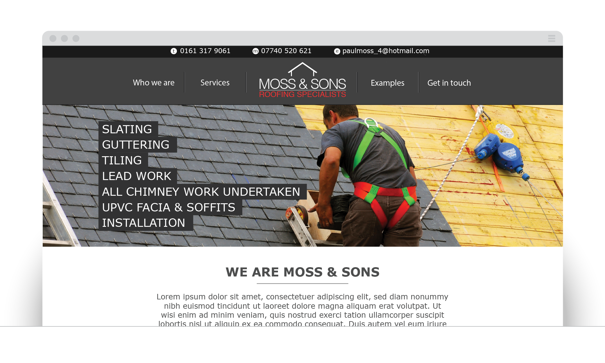
Moss & Sons
The Local Link Magazine
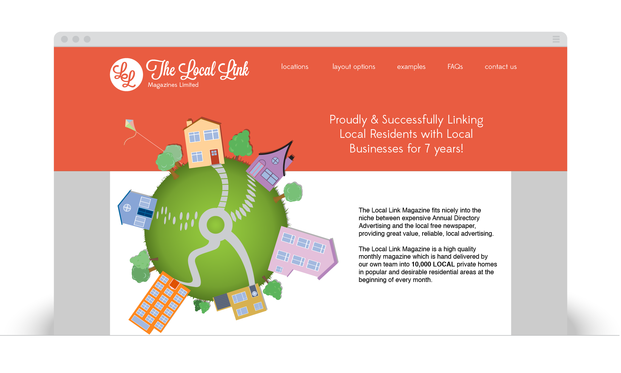
I created The Local Link Magazine's new logo to define their online presence and represent them in digital media.
Following their continued success as a popular local monthly advertising magazine, Local Link wanted an online presence to make them searchable and contactable, whilst giving detailed information about their price plans and what they can offer.
Using the variety of colour and illustrations used in the magazines, I created headers that alternate colour depending on the page, animations showcasing the page's key functions and directing focus towards the main elements of the site.
I received fantastic feedback for the speed and quality of my work, and provided Local Link with a fresh, relevant and engaging website, with a logo that defined their brand and connected the digital and physical media.


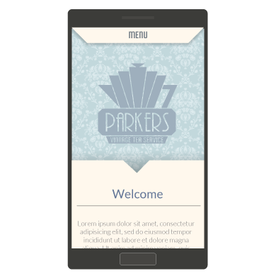
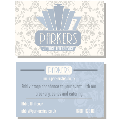
Parkers Vintage Tea
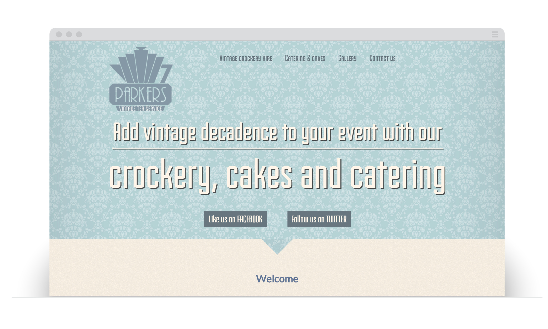
Parkers Vintage Tea gave me a great opportunity to do a full branding treatment, including a fully responsive website, business cards and flyers for the business. I took inspiration for the logo from the Art Deco movement, utilising symmetry and strong shapes to create a variety of designs. The final logo has a strong geometric pattern that also portrays a teapot, but not neccessarily at first glance.
The brand design flowed into the design of the website, incorporating strong lines and art-deco styled eleements. The site is open dn welcoming, with a lot of content and pages to provide a full vision of what Parkers do. The challenge was taking this content and making it mobile responsive.
For the stationery, I continued the theme and images used in the website to carry a consistent feel and message, along with selected photos to give and impression of the events.

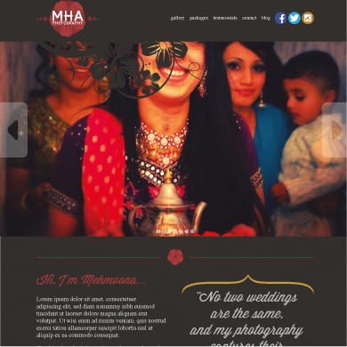
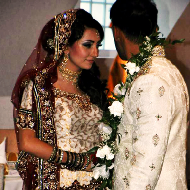
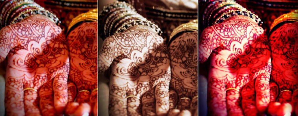
MHA Photography
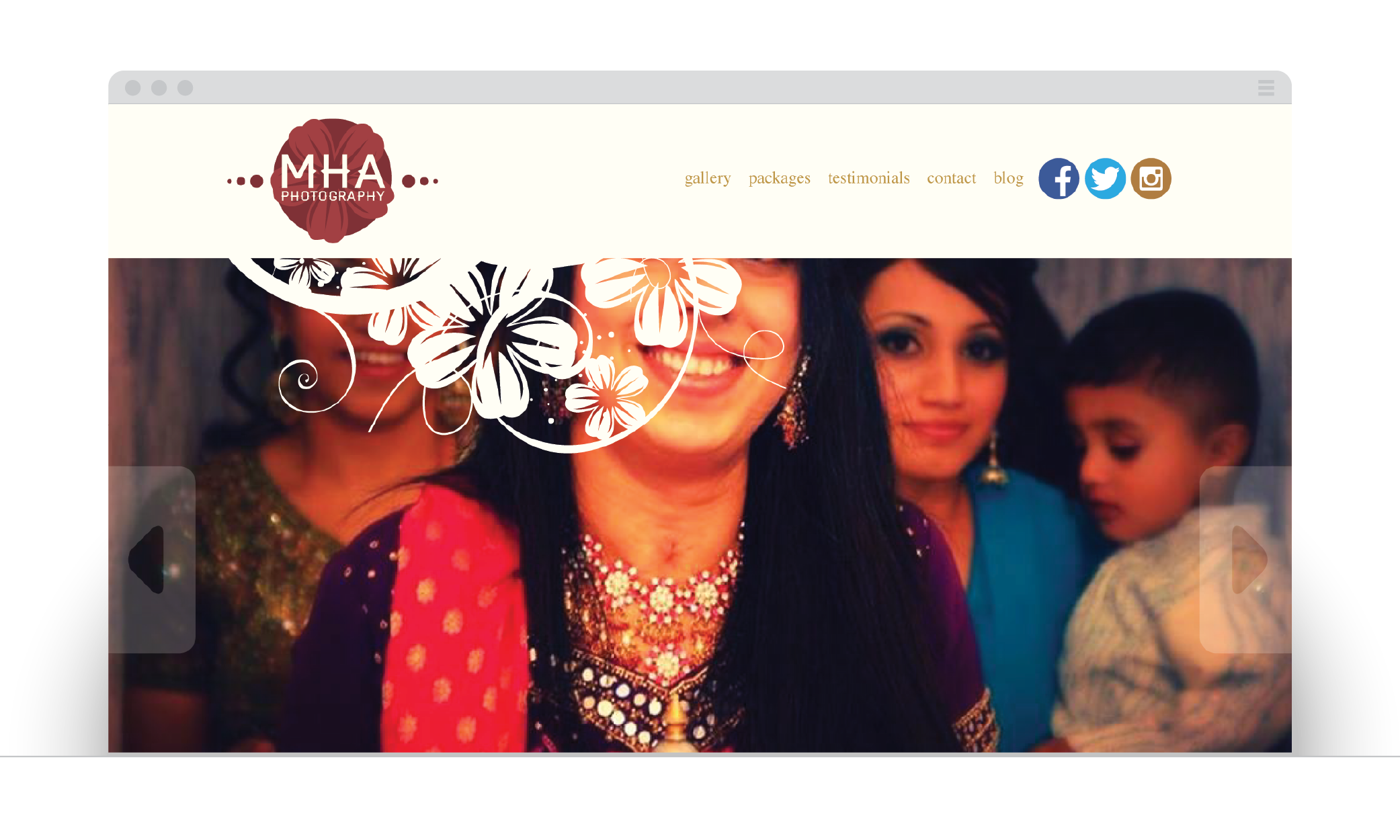
Mehmoona was gaining reputation and popularity as a wedding photographer and decided it was time to have a web presence and visual identity. I worked closely with Mehmoona to create a logo that was modern in it's approach to design but retained symbolism and colours involved with Asian weddings. This gives the logo a timeless presense and carries a message of what Mehmoona does.
For the site, I wanted to show as many of Mehmoona's images as possible on each page. We used a large sliding banner on the main page as a showcase for Mehmoona's favourite images and used static strips of images for the headers on every other page. This makes Mehmoona's photography inescapable, and allows the visitor to picture their wedding through these images. To give a personal feel and connection with Mehmoona, we have introduced a gallery to showcase some of the weddings she photographs, and a blog which will give an insight into how she does her work and deals with her customers.
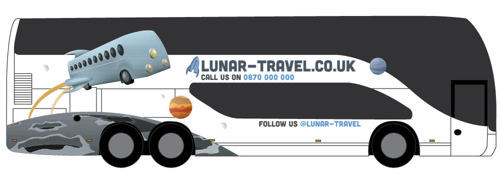
Lunar Travel

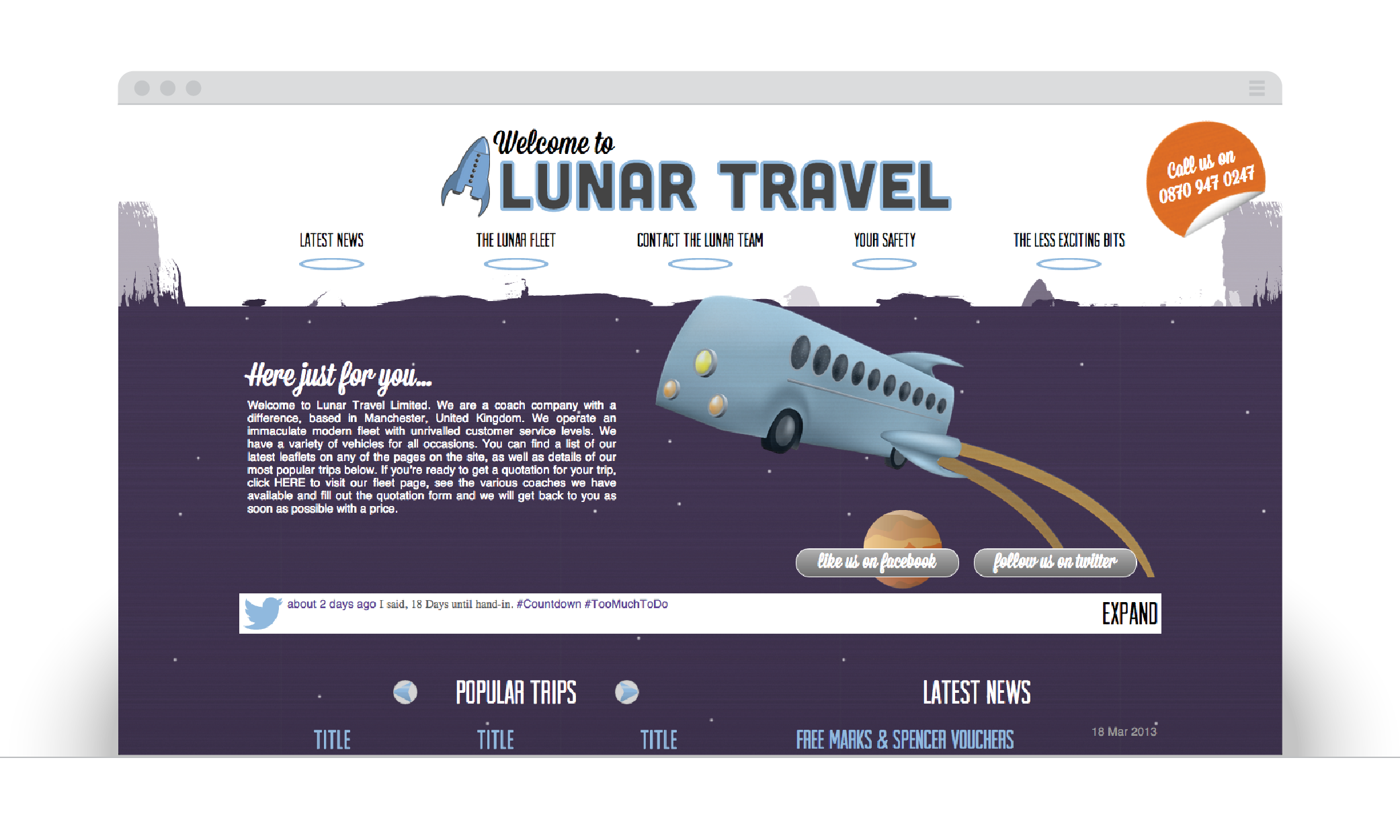
I created the Lunar Travel brand for a new coach company.
After coming up with the name "Lunar Travel", based around the brief of freedom and possibilities, I decided to go for a retro space theme for the branding and illustrations. These illustrations show a glamourous and adventurous side to travel, something which has become detached from today's ideas around coach trips.
The images provoke a classic, yet alternate version of the past, where space travel was commercialised and accessible to all. I wanted to create a connection between these fantastical images and the company.
When designing the site for Lunar Travel, the priority was to carry over the brand and illustrations from the bus designs and seemlessly fit them into a site design that contnued to embelish and build upon the identity.
I built every page and element to be scalable to fit any screen width provided, from desktop to mobile, this gives the users the most consistant experience no matter how they choose to view the site. With the target audience over a broad age range, I have used large, clear navigation, obvious links and quick access to sections on each page. All of these elements combine to create a site that is easy to navigate and encourages exploration.